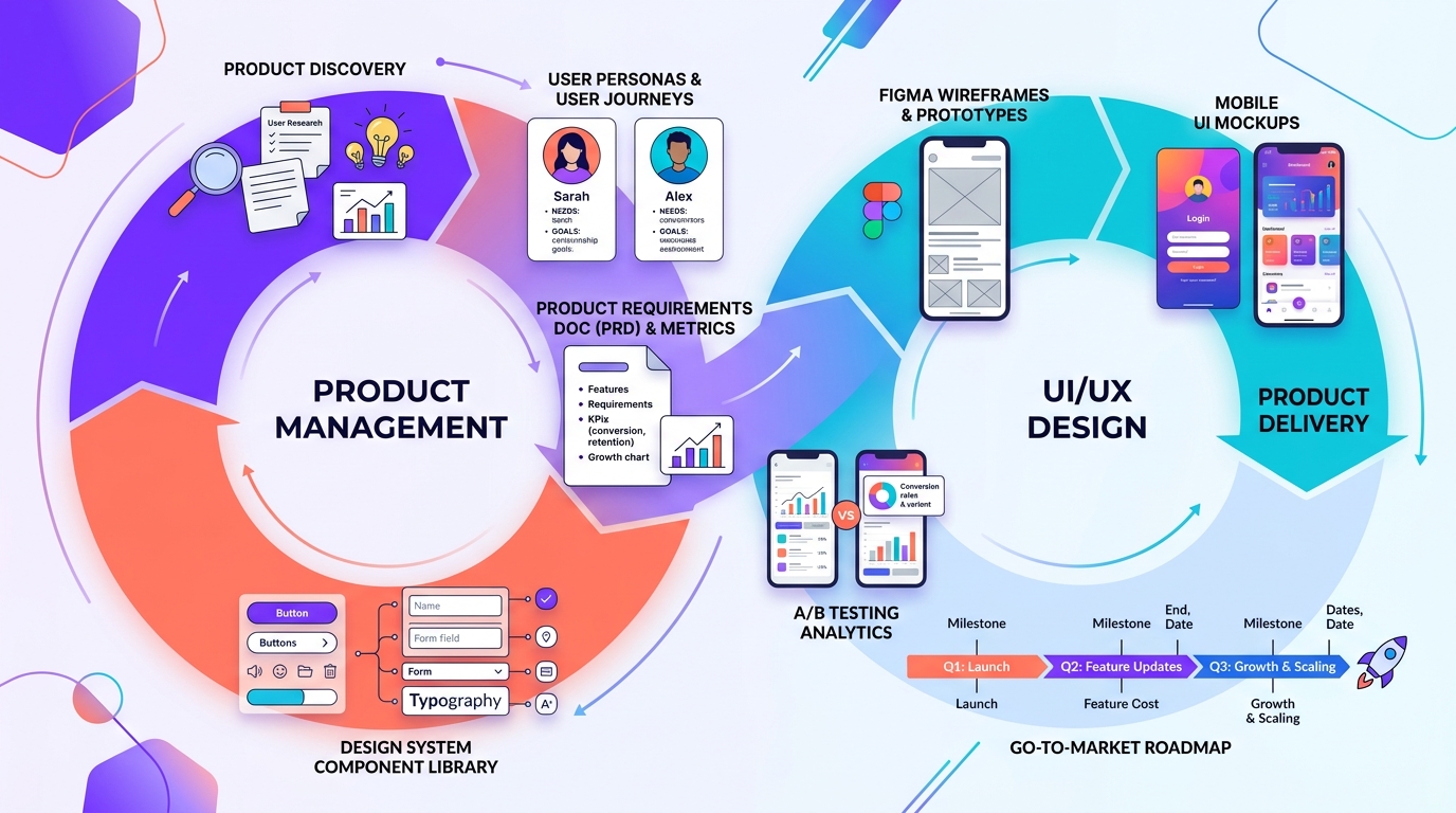
UI/UX Designer Interview Guide: Portfolio Case Studies, Design Process & Whiteboard Challenges
Craft a hiring-ready design portfolio and handle product design critiques, app redesign challenges and stakeholder questions with confidence.
Executive Overview & Industry Landscape
Design hiring is decided by evidence of thinking, not by screenshots of beautiful screens. A hiring panel wants to see how you define problems, use research, make trade-offs under constraints and measure whether the design worked. The portfolio review, a live design challenge and a collaboration round with product and engineering are the standard stages. This guide shows how to present your work as a story of decisions and outcomes.
Core Methodology & Strategic Frameworks
The Portfolio Case Study Structure
A narrative layout that recruiters can scan in under two minutes.
- Context in three lines: product, your role, team, timeline and the problem in one sentence
- Research and insights: who the users are, what you learned and how it changed the direction
- Process and decisions: key alternatives you explored and why you rejected them
- Final solution: only the 3 to 5 most important screens with annotations
- Outcome and learning: metrics (task success, conversion, support tickets) and what you would improve
The Live Design Challenge Framework
For prompts such as "design a ride-sharing feature for senior citizens" within 45 to 60 minutes.
- Clarify scope, platform, constraints and success metric before sketching
- Define the primary user, their goal and the most painful moments in the journey
- Brainstorm several solutions, then choose one with explicit prioritization reasoning
- Sketch the key flow and a critical screen, covering empty, error and edge states
- Close with how you would test it and which metric would prove it worked
Design Fundamentals Interviewers Probe
Principles you should be able to defend with examples from your own work.
Usability Heuristics and Accessibility
Know Nielsen's heuristics such as visibility of system status, error prevention, consistency, recognition rather than recall, and flexibility for expert users. For accessibility, cover sufficient color contrast (WCAG AA expects 4.5:1 for normal text), touch targets of roughly 44 to 48 pixels, visible focus states, meaningful labels for screen readers and not relying on color alone to convey meaning.
- Hick's Law: more choices increase decision time
- Fitts's Law: important targets should be large and close to where the user's attention already is
- Design systems: tokens, components and documentation keep products consistent at scale
Research Methods and When to Use Them
Use interviews and contextual inquiry to understand motivations, surveys to quantify patterns, usability tests to find friction in a prototype, analytics to see what happens at scale and A/B tests to compare solutions. Five users per round typically reveal the majority of major usability problems, so test small and often rather than waiting for a perfect study.
Collaboration and Critique Rounds
Show you are a partner to product managers and engineers, not a hand-off station.
Handling Critique and Pushback
When challenged, restate the concern to confirm understanding, explain the user problem your decision addressed, and offer to test both options when evidence is thin. Distinguish personal taste from user evidence. Strong designers also discuss feasibility early with engineers and use component libraries to reduce implementation cost.
Real Interview Questions & Model Responses
Verbatim interview questions asked at top employers with structured thought frameworks and scoring criteria.
Redesign the checkout flow of a food delivery app that has a high drop-off at payment.
- Start from evidence on why users drop, not from visual preferences.
- Name a primary metric and a guardrail metric.
Tell us about a design decision you made that you later realized was wrong.
- Own the mistake with specifics.
- Show a process change that prevents repeating it.
Critical Mistakes That Cause Immediate Rejections
- ×Showing only polished final screens with no research, trade-offs or outcomes.
- ×Presenting a team project without clarifying your personal contribution.
- ×Jumping straight to solutions in the whiteboard challenge without clarifying the problem.
- ×Ignoring edge cases such as empty states, errors, slow networks and accessibility.
- ×Defending designs by personal taste instead of user evidence.
Actionable 30-Day Preparation Checklist
- Curate three to four strong case studies instead of ten shallow ones.
- Add a measurable outcome or a clearly stated learning to each case study.
- Practice five whiteboard challenges with a 45-minute timer and speak your reasoning aloud.
- Learn Figma components, auto layout, variables and prototyping fundamentals.
- Run at least one usability test with five real users and document findings.
- Prepare a ten-minute portfolio walkthrough and a two-minute version.
- Research the company's product and prepare two thoughtful critiques with suggested improvements.
Frequently Asked Questions
What is the difference between UI and UX design?
UX design covers the whole experience: research, flows, information architecture and usability. UI design focuses on the visual layer: layout, typography, color, components and interaction details. Many roles combine both.
How many projects should a UX portfolio have?
Three to four deep case studies are usually better than many shallow ones, because reviewers want to understand your process and judgment.
Do designers need to know how to code?
It is not mandatory, but understanding HTML, CSS and component constraints helps you collaborate with engineers and design realistically.